STEAM Academy
Explore the site with ease
The STEAM Academy at Cal Poly Pomona offers middle and high school students with a unique learning experience in science, technology, engineering, art, and math. I had the opportunity to collaborate with the founder to redesign the website for an intuitive experience.
Duration
Jan 2024 to May 2024
Project Type
UX/UI
Tools
Figma
Zoom
Role
UX/UI Designer
ABOUT THE STEAM ACADEMY
Students can enroll in any of the STEAM Academy’s programs: Custom Cohorts, STEAM Camp, or Migrant Education. Each program is designed to prepare students for college success while fostering essential life skills.
PROBLEM
Users faced challenges navigating the website due to poor readability caused by insufficient contrast between the text and background, as well as an unclear visual and structural hierarchy. These issues made it difficult for users to locate information, ultimately resulting in a frustrating user experience.
CHALLENGE
How can the STEAM Academy website ensure intuitive navigation that enhances engagement and makes information accessible for students and parents?
DESIGN SOLUTIONS
Simplified Layout
It is necessary to make the navigation cohesive, as the existing site overwhelms the user with the blocks of text
Accessible Design
Enhancing the color contrast, text, and component states improves readability and usability, ensuring a more user-friendly experience
More Imagery
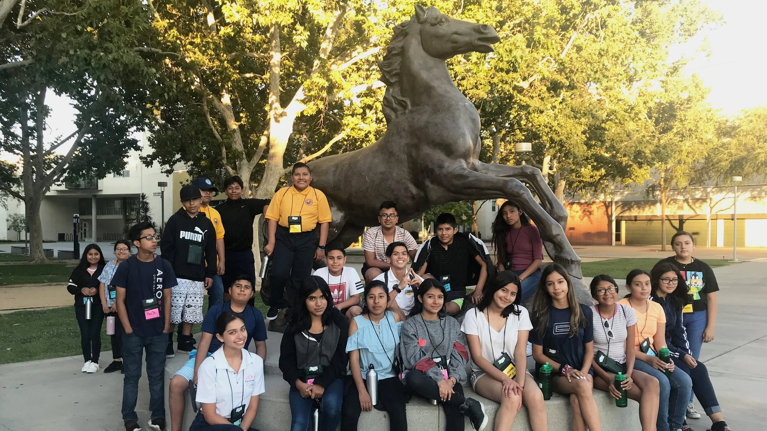
Showcasing students and the projects they work on strengthens the program's reputation

The Initial Prototype
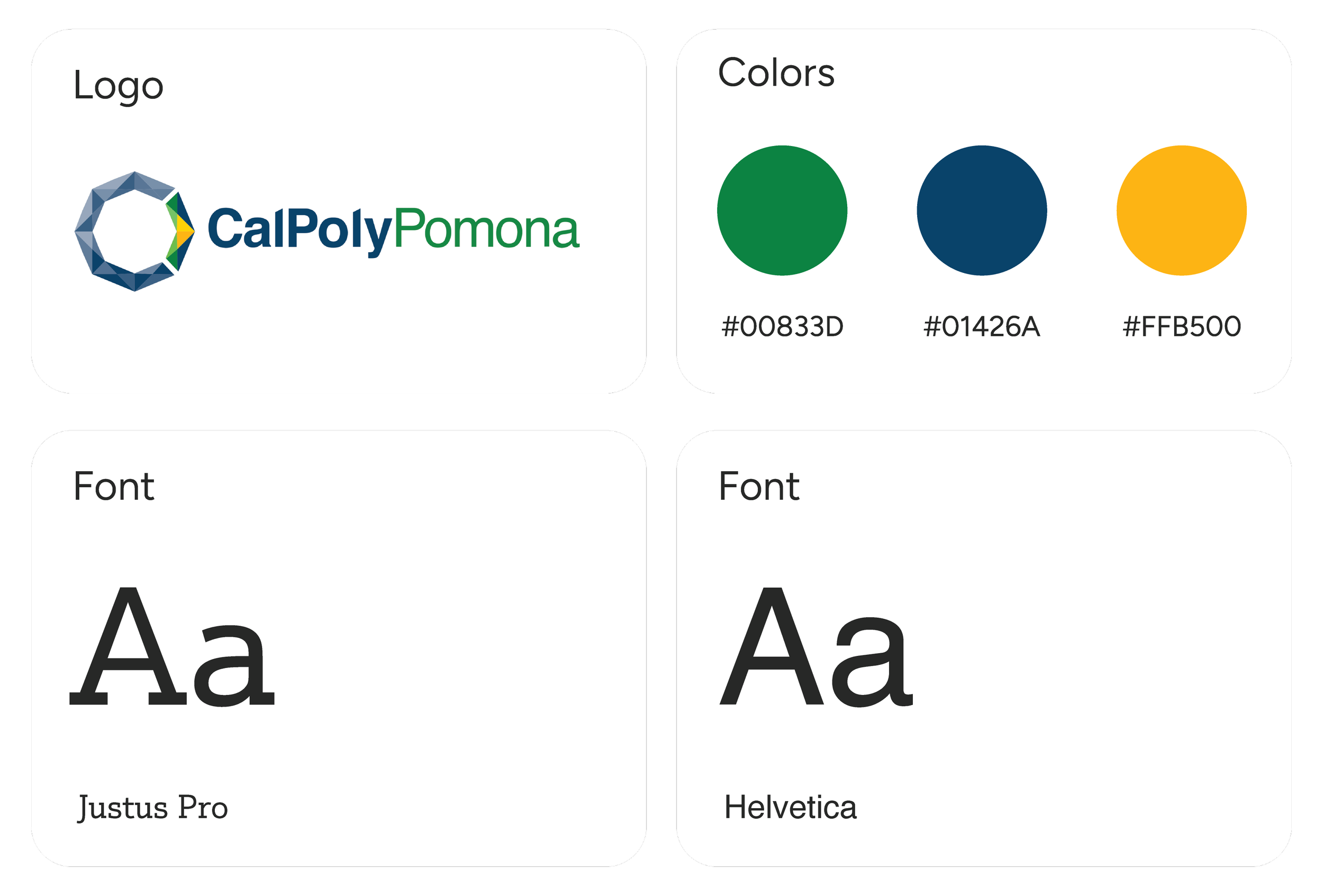
BEFORE CAL POLY POMONA’S REBRANDING
The layout is improved by implementing a stronger design system and emphasizing Cal Poly Pomona's brand colors of blue and green. Colored blocks draw attention to key information.
HIGHLIGHTING THE GOALS
The program’s goals and activities help users understand its benefits. This makes it easier for users to recognize how it aligns with their needs and aspirations.
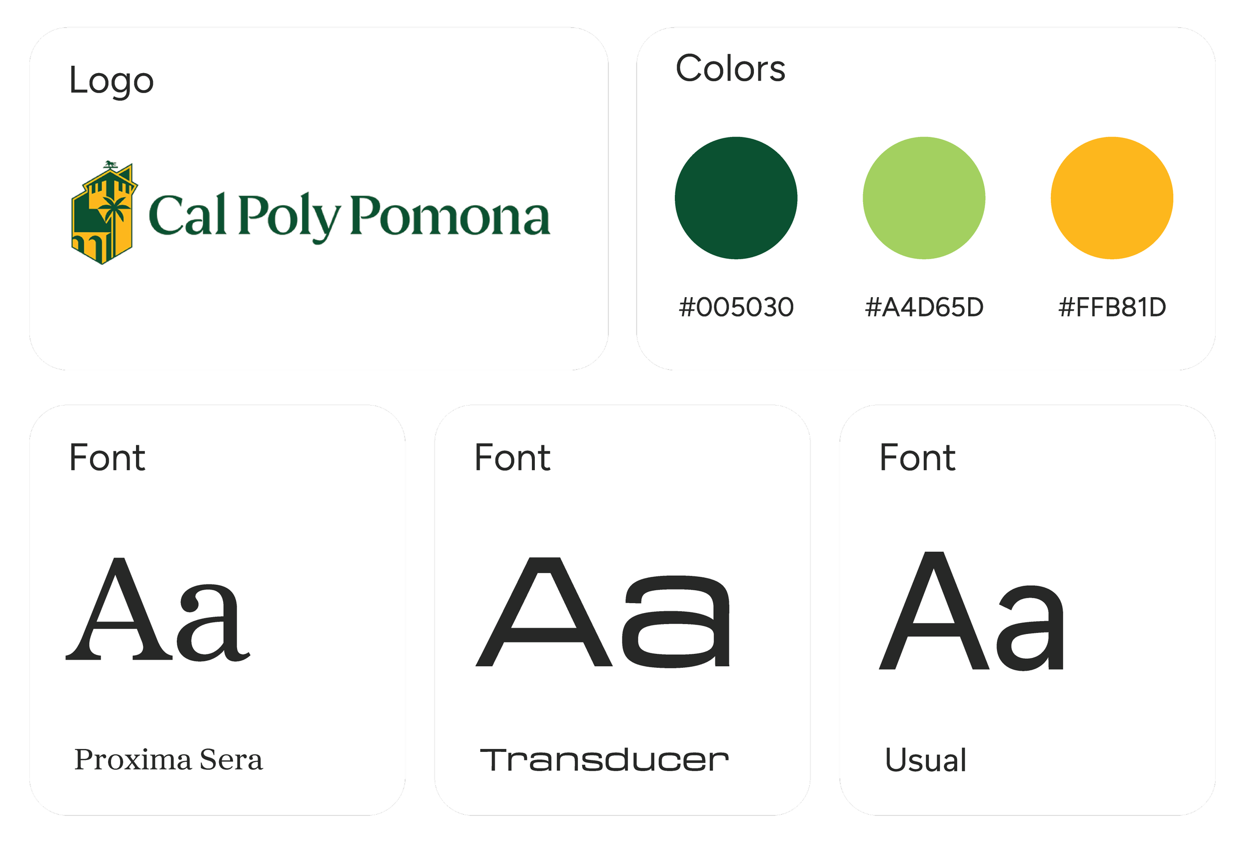
THE NEW BRAND IDENTITY
No longer wanting to be a hidden gem, Cal Poly Pomona aims to elevate its presence with a brand refresh.
Revisions After User Feedback
ADDING INFORMATION AND BUTTONS
Users feel more committed to registering for the programs with more information and buttons.
STUDENT TESTIMONIALS ON EACH PROGRAM PAGE
The testimonials reinforce the program’s credibility. It helps prospective students and their families envision its value and motivates them to apply.
IMPROVING THE NAVIGATION BAR
The navigation bar highlights key links to various information regarding the program. Users found the previous navigation bars confusing due to overlapping options and were unsure if the home button led to Cal Poly Pomona's homepage or the STEAM Academy's homepage.

The Hi-Fi Prototype
EFFICIENT NAVIGATION
Navigation is simplified with the balance of imagery and text. This allows users to identify important information.
COHESIVE INFORMATION FOR EACH PROGRAM
The layout guides users through the site and reinforces the visual identity of Cal Poly Pomona's rebrand. Users can compare programs and select the one that best suits their interests by reviewing the goals and activities.
SIGNING UP FOR THE DESIRED PROGRAM
The registration form features a simple layout to ensure quick and easy enrollment. Users can complete the process effortlessly, which enhances their satisfaction and engagement.
Final Takeaways
THE IMPORTANCE OF ACCESSIBLE DESIGN
Designing for accessibility promotes an inclusive experience for all users. Emphasizing strong color contrast, larger text, and clear component states ensures intuitive navigation.
PROBLEM SOLVING ON A STRICT TIMELINE
This project taught me to empathize with users under time constraints, while also allowing me to practice and showcase my prototyping and UI skills.


